
Colour contrasts explained
Colours on a website can be an important part of brand identity. But your colour contrasts need to be enough for everyone to be able to see your content.
Colours on a website can be an important part of brand identity. But your colour contrasts need to be enough for everyone to be able to see your content.

This post details some useful schemes you can apply to once you have your ADP Award Letter. It focuses on Scotland, but most of it applies to PIP, too.

‘Helping’ disabled people without asking isn’t just a consent issue. It’s a health and safety issue, too.

Trans Visibility Day seems an appropriate date to let people know that I’ve started using they/them pronouns. I’m also taking the chance to share my personal thoughts on gender.

This post explains what headings are and how they work, so you can use them to structure accessible content.
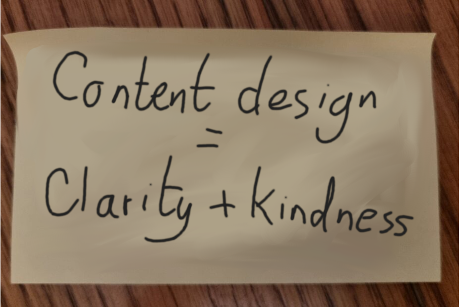
Content around post-death admin is challenging for a lot of reasons. This post addresses something that might seem simple: use of past or present tense.
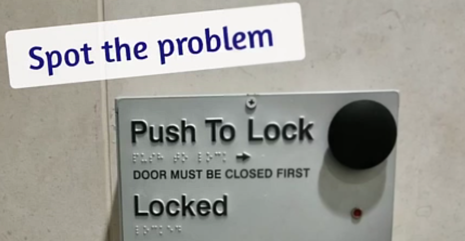
A service can have well designed accessibility in almost all the details, but without taking a look at the bigger picture, it can still be unusable.

When people start to mock poor spelling, or try and dismantle arguments based on bad grammar, things have crossed the line fully into ableism.
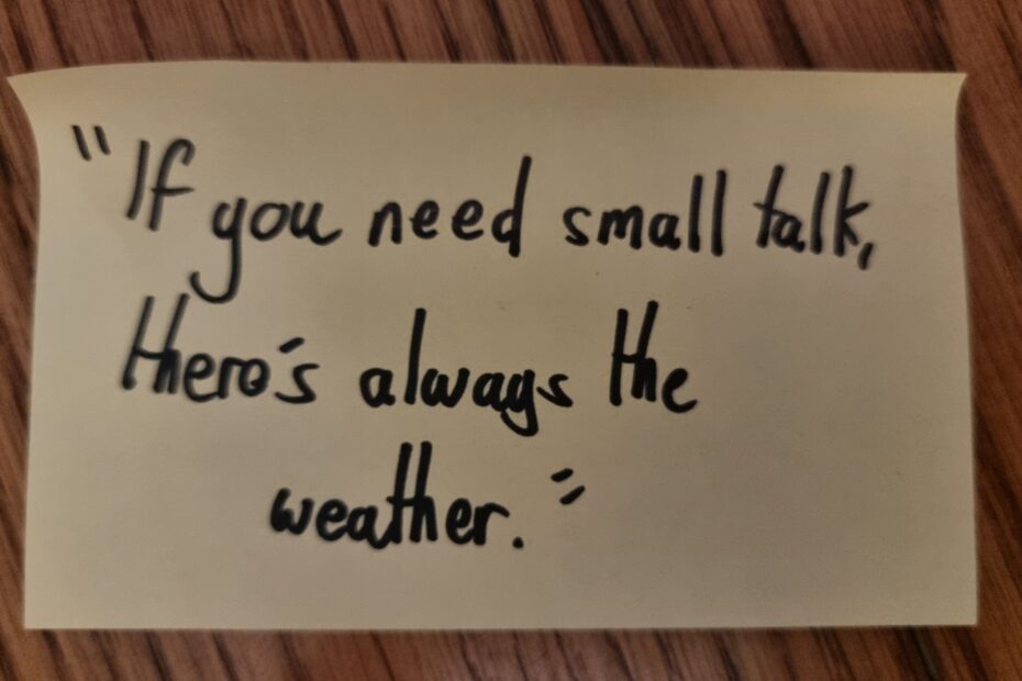
People asking about diagnoses might be trying to help, might be making small talk, or might just be curious. Your intentions might be good – so why exactly shouldn’t you ask people this question?
I often need to test the content I’m creating with real people. Sign up to my tester database if you’re interested in becoming a paid tester.
Contact me or follow on social media to see how we could work together.