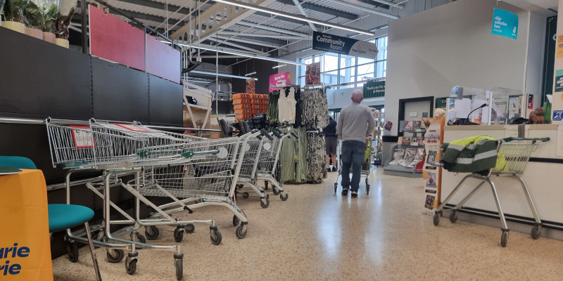
It was my daughter’s birthday last week, and she desperately wanted some cocktail umbrellas. So I went into town to try and find some, and made some observations about digital accessibility along the way.
Navigating high street accessibility
Buying things online is the most accessible option for most things I need. But that’s not always an option, so I’m pretty used to going around shops using a wheelchair now, and the shops generally fall into one of three categories.
1. ‘I don’t care’ shops
There are many, many shops I simply can’t get into when I’m using my chair.
They might have:
- stepped access
- doors that are too heavy, too narrow, or both
- narrow aisles
- high counters
It’s clear no-one has given accessibility a second thought.
2. ‘I can help you!’ shops
Then there are shop that say they’ll try.
They might have:
- a bell you can ring to get help – this might even work, but it equally might not
- a portable ramp they can bring out – if you can communicate that you need one, and if they can find the key to the right cupboard
- willing staff who will bring you things from areas you can’t access
The staff try their hardest.
And it’s awful, particularly if I’m just browsing. I want to be able to make my own quiet way around a space, and have time to think.
3. Shops designed for accessibility…almost
Other shops are well-designed from the outset.
They might have:
- level access, or a proper, inbuilt ramp
- doors that are wide and open automatically
- aisles wide enough to get down
- counters that are set down low, or with variable height
The party shop was in this category. Excellent. There was even an internal ramp, because the shop was on two levels.
I found my way handily to the right aisle. It was a lovely wide aisle.
But it was absolutely clogged up with boxes, just in front of where I needed to be.
Faking a miracle
Although many wheelchair users are completely reliant on their chair, a huge proportion are ‘ambulatory users’ like me. This means we can walk short distances. So when I come across situations like blocked aisles, I have to get out of my wheelchair and squeeze along to find what I was looking for.
This is physically painful, and also psychologically difficult. On my cocktail umbrella hunt, I’d already had one cheery, well-meant comment: ‘It’s a miracle! She can walk!’.
People find it very confusing when wheelchair users get up. We get accused of faking, people think we are suddenly ‘cured’, or they just make jokes about how funny it looks. I’m surprised when I don’t get a comment like this, not when I do. It’s hugely upsetting.
Blocked aisles are everywhere
This isn’t an isolated example. I’m forever going into shops with well-designed access, but a massive display in what should function as a wheelchair turning circle.
Having an experience like this can feel worse than going past shops in the first category. At least they’re upfront about not caring. Expecting an accessible experience and then being disappointed feels like being baited.
Navigating digital accessibility
I’m sharing this story because it’s relevant to creating accessible, inclusive digital content. Websites and apps can fall into the same three categories as high street shops.
1. ‘I don’t care’ websites
Some sites and apps clearly haven’t thought about accessibility at all. Whether in formal testing or just daily life, I come across sites like this all the time.
They might have:
- areas of the page you can’t get to using keyboard navigation
- flashing animation you can’t switch off
- colour contrasts that make the content hard to read
- text that flows right off the page when you zoom in
These site owners don’t know what they don’t know. They’ve never even heard of a screenreader.
2. ‘I can help you!’ websites
Other companies know they should care about accessibility.
They might have:
- staff who are genuinely passionate about access, and trying their best within an imperfect system
- diversity statements telling you they care
- an email address to contact if you can’t access the content
I’m not criticising these sites. (At least, not all of them.) Often the issue is that people have realised the problems too late in the process. They don’t know how to go back and fix accessibility issues. Maybe they’ve paid for a system that’s inaccessible, and backtracking from all that is a complex process.
3. Sites designed for accessibility…almost
Some websites and apps are getting it right from the start.
The dev teams understand accessibility and know their WCAG. (That’s the Web Content Accessibility Guidelines., which say sites should be Perceivable, Operable, Understandable and Robust.)
The site:
- is operable and robust
- works seamlessly with assistive tech
- allows content to resize and flow
- has no movement that can’t be stopped
But a site without content is like a shop with no stock. And badly-placed content, like badly-placed stock, can ruin the site’s accessibility.
Is your content ‘blocking the wide aisles’?
This is where content accessibility comes in.
As a content designer, you need to centre accessibility and inclusivity. As a leader, you need to invest in training for your content teams.
You need to consider things like:
- How understandable is your content? It’s no good if a screenreader can read the words, but you’ve used 65 words in a single sentence.
- Have you structured your headings properly? Keyboard navigation falls down if you’ve skipped heading levels, or focused on the look, not the function, of the headings.
- Have you checked the subtitles on your audio or video content? Automatic subtitling is a great starting point. But you always need a human to check them.
- Are your documents accessible? The download experience might be seamless, but that’s no good if the document itself can’t be read.
- Does your link text and heading text make sense? Effortless navigation is useless if it leads you to a heading that reads ‘more information’ or a link with the same text as 7 other links on the page.
- How inclusive is your content? It can feel like baiting if you have text that displays beautifully at 400% zoom, but that text uses triggering or disparaging language.
These are just a few examples of how bad content can metaphorically ‘block the wide aisles’. Content is precious, and doing it right is a skill.no stock. And badly-placed content, like badly-placed stock, can ruin the site’s accessibility.
Which category is your site in?
I’m not here to judge your site, whatever category it falls into. If you’ve read this far you know enough to care, and that’s where everyone starts.
Instead, I’ll say thank you, to:
- content designers who are trying their best working with legacy content systems that make it hard
- developers who are battling to solve existing issues, and centring accessibility in new designs
- leaders who understand they need to invest time, money and training in accessibility at all stages, and who respect the importance of content design in that process
Thank you to everyone who has realised enough to care, whether you came to that realisation 10 years ago, or five minutes ago. We’re all on the same team.
Unblocking your aisles
If you’re feeling overwhelmed by the task of making your content more accessible and inclusive, get in touch. I can help with training, audits, research, and content redesign.